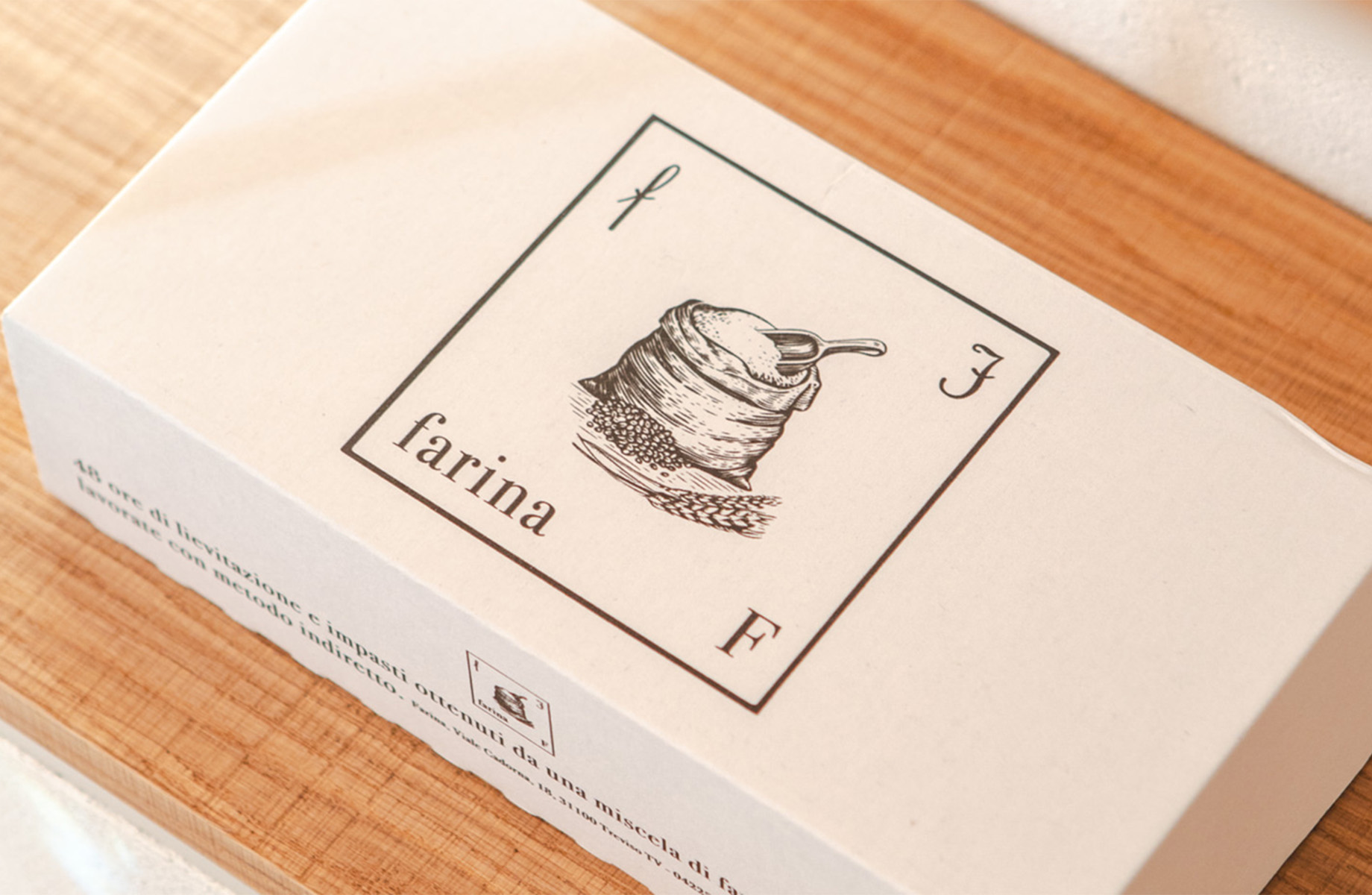
Goal Design of brand identity for Farina bakery
Concept “All ideas that have enormous consequences are always simple ideas” – Lev Tolstoy
Design Simplicity as the essential expression of purity, of genuineness. Just as flour is the main ingredient that brings baked goods to life, so the letters of the alphabet are the building blocks that construct first words, then sentences, and finally stories. In our collective memory, the place where we first discovered the letters of the alphabet as children is the alphabet book. This is the suggestion that gave birth to the logo of the new Treviso Bakery. The language of the new brand has been transferred to the service materials and packaging while respecting the essentiality proper to the project; the new language of the brand identity also contaminates the shop-laboratory, in shapes, materials, and colors. The outcome is a warm, welcoming environment in which one can find yeast products that smell of quality and tradition in which every detail brings back to the essential idea of simplicity.


