Yellow
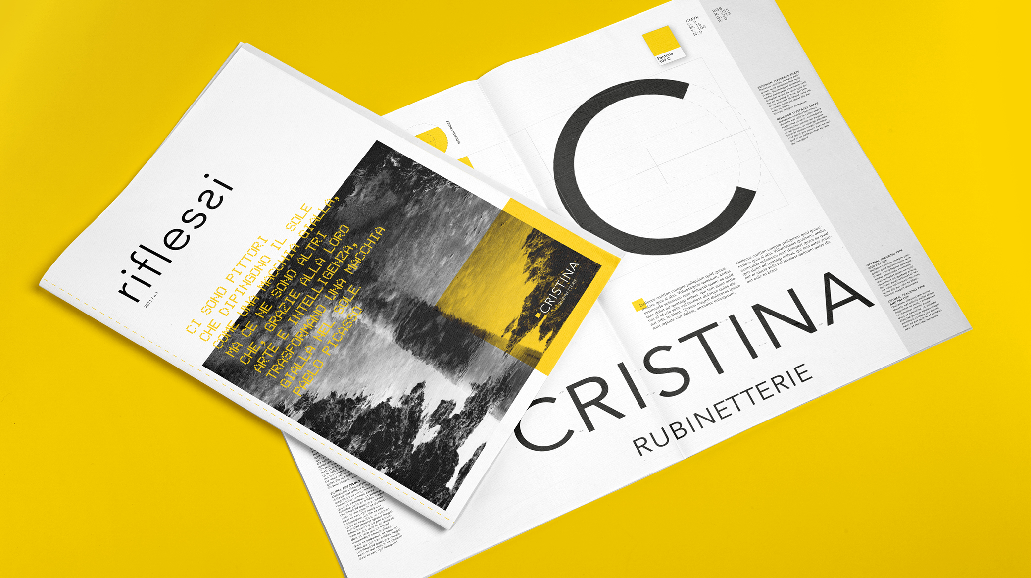
Goal The project has been collected in a Brand Manual which defines the rules for using the brand, the colors, the typography and the graphic style.
Concept The logotype has been redesigned and taken outside the Cristina yellow square which is reduced but, at the same time, it acquires a more symbolic role.
Design After an in-depth analysis of the representative semantic elements of the Cristina brand, we carried out a complete rebranding, which involved both the basic elements of the company identity such as the logotype, the brand and the corporate color, and the entire visual language of the brand. This completely renewed the corporate identity as well as the sales tools and digital communication.
category: Brand identity
client: Cristina
year: 2020


