Play Video
caratteri nobili
Goal New brand identity of San Osvaldo winery and their entire product collection.
Concept The nobility of the great Venetian typographic tradition reinterprets the noble nature of San Osvaldo’s Venetian wines.
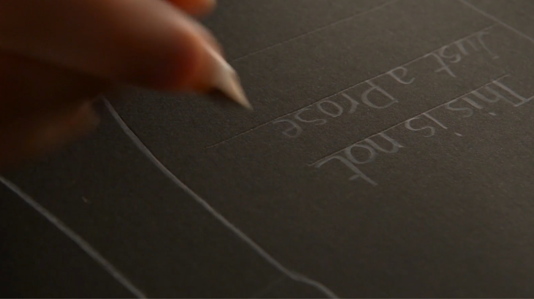
Design The entire visual identity of the San Osvaldo winery is told by a new storytelling that recalls the old printing presses from where culture was diffused. A visual tale entrusted to the symbolic language of ancient wooden and lead fonts capable of conveying a warm feeling of experience. For the production of the labels, ancient movable types kept at the Tipoteca TIFF in Cornuda were used and printed with late 19th century manual plates.
category: Packaging
client: S. Osvaldo
year: 2016-2017

1 / 2
2 / 2
1 / 2
2 / 2
1 / 3
2 / 3
3 / 3


